Reverse engineering targeted emails from 2012 Campaign
Updated: 2012-05-31 16:34:04
After noticing the Obama campaign was sending variations of an email to voters, ProPublica identified six distinct types with certain …

 Background The Centre for Economic and Social Inclusion is the UK’s leading not-for-profit company dedicated to tackling disadvantage and promoting social inclusion in the labour market. CESI is involved in a wide range of initiatives from the provision of training and events to the collection and analysis of UK labour market statistics. One of the [...]
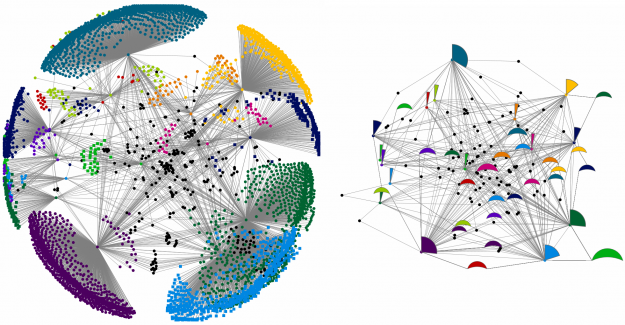 Network diagrams are notoriously messy. Even a small number of nodes can be overwhelmed by their chaotic placement and relationships. …
 Background The Centers for Disease Control and Prevention (CDC) is a government agency that was set up to protect health and promote quality of life through the prevention and control of disease, injury, and disability. Part of its work is to harvest expertise and information that will allow it to create tools that people and [...]
 Background Pembrokeshire County Council has a long-held ambition to put data into the public domain in a usable and easily-understandable format. Much of this data has geographic information and it has been a natural development to use data visualisation. Adam Crocker, GIS/Information Manager in the Policy & Corporate Planning department says the council collects a large [...]
 When I meet with people and talk about our work, I get asked a lot what technology we use to create interactive and dynamic data visualizations. To help you get started, we have put together a selection of the tools we use the most and that we enjoy working with.
 Writing in the Health Service Journal this week (subscription needed) paediatric registrar Dr Ronny Cheung highlights the NHS Atlas of Variation in Healthcare and in particular the Child Health Atlas as a useful tool in helping NHS commissioners reduce unwarranted variation in healthcare. Unwarranted variation is a term associated with the work of professor Jack [...]